skip to main | skip to sidebar

Map Catalog

Sunday, December 7, 2008

Cartogram

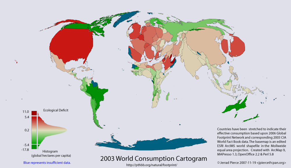
Cartograms can display information through distorted shapes to convey a message. In this map, world consumption is the topic at hand, therefore countries in North America and Europe seem to be inflated while countries in Africa and South America are made to look weak. They are not meant to provide accurate shapes of land.  

http://pthbb.org/natural/footprint/2003/cartogram.gif
Posted by Rebekah at 11:20 PM

No comments:

Post a Comment

Newer Post Older Post Home
Subscribe to: Post Comments (Atom)

Blog Archive

  • ▼  2008 (50)
    • ▼  December (48)
      • Telegraph Map
      • T-O Map
      • Data Visualization
      • Star Plot
      • Correlation Matrix
      • Similarity Matrix
      • Box Plot
      • Histogram
      • Parallel Coordinate Map
      • Triangular Plot
      • Windrose
      • Climograph
      • Stem and Leaf Plot
      • Population Pyramid
      • Scatterplot
      • Index Value Plot
      • Lorenz Curve
      • Pie Chart
      • Ptolemy Map
      • Cave Paintings
      • Bivariate Chropleth Map
      • Classed Choropleth Maps
      • Continuously Variable Proportional Circle Map
      • DOQQ
      • Digital Elevation Map (DEM)
      • Digital Raster Graphics (DRG)
      • Isopleth
      • Isopach
      • Isohyet
      • Isotachs
      • Isobar Map
      • LIDAR Image
      • Doppler Radar Image
      • Black and White Aerial Image
      • Infrared Aerial Image
      • Statistical Map
      • Cartogram
      • Flow Map
      • Isoline Map
      • Proportional Circle Maps
      • Dot Distribution Map
      • Propaganda Map
      • Hypsometric Map
      • PLSS Map
      • Cadastral Maps
      • Thematic Map
      • Topographic Map
      • Planimetric Map
    • ►  October (1)
    • ►  August (1)

About Me

Rebekah
View my complete profile