Monday, December 8, 2008

Telegraph Map


The telegraph map is the precursor to modern weather maps. The telegraph was the first way that weather was reported through electric means. It led the way for more advanced forms of electronically reporting and forecasting weather. 

http://www.willowbunchtelegraphoffice.ca/img/telegraph-map.jpg

T-O Map


T-O maps were created during the Middle Ages. At the center of the map was Jerusalem, which was because it was heavily based upon religion. It was presented in a spherical shape, and only included three continents. 

http://images.google.com/imgres?imgurl=http://upload.wikimedia.org/wikipedia/commons/9/95/TO_map.gif&imgrefurl=http://en.wikipedia.org/wiki/Cartography&usg=__BuqbjQTHDVeQsvolkwpp-S9392U=&h=803&w=815&sz=24&hl=en&start=2&um=1&tbnid=ZkuFTwb2T3uriM:&tbnh=142&tbnw=144&prev=/images%3Fq%3Dt%2Bo%2Bmap%26um%3D1%26hl%3Den%26client%3Dsafari%26rls%3Den-us%26sa%3DG

Data Visualization


http://blogs.zdnet.com/projectfailures/images/online_social_roles3.jpg

Star Plot


Star Plots display within each figure, one variable per line. The length of the lines are equal to the value of that variable. 

http://www.mathworks.com/products/demos/shipping/stats/mvplotdemo_05_thumbnail.png

Correlation Matrix


The Correlation Matrix is a map that represents the correlations between itself and each variable, for each pair. The solid diagonal always consists of ones. 

http://yin.che.wisc.edu/images/ProteinMatrix.jpg

Similarity Matrix


A similarity matrix shows similarities among different data points. The solid line represents perfect similarity between the data in the graph. 

http://www.jbaas.com/articles/pictures/vol_2_n2_art7_fig2.gif

Box Plot


Box plots are graphic representations of statistical information. Each box represents its own data, and can be compared. The line in the center of each box is representative of a median value. The whiskered lines running vertically represent the minimum and maximum values for the data represented in the box. 

http://math.youngzones.org/boxplot.gif

Histogram


Histograms display tabulated frequencies that are graphically represented by bars, usually. They have an x and a y axis which represent frequency of the certain category being discussed. 

http://escience.anu.edu.au/lecture/cg/CGIntroduction/Data/histogram.gif

Parallel Coordinate Map


Parallel Coordinates are many times used to plot large data sets. They show multivariate patterns in including all data into one plot. 

http://www-vis.lbl.gov/Events/SC07/Drosophila/3DParallelCoordinates.png


Triangular Plot


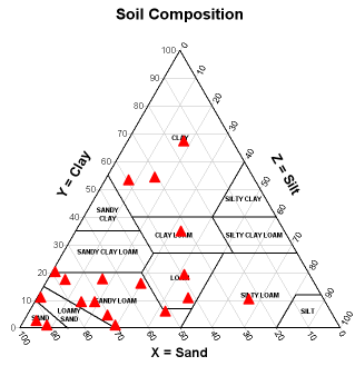
Triangular Plots show three variables, and compare the three as their proportions instersect with one another. 

http://www.dplot.com/triangle_plot/tri2.png

Windrose


A windrose measures the frequencies of wind direction. In this map, the frequencies are per 10 degrees. 

http://mensch.org/vplot/windrose/windrose.png

Climograph


Climographs show the amount of precipitation in a given area by month. In this map, the precipitation is measured with the black bars and the temperature by the green line. 

http://geography.ridley.on.ca/CGC1D/Students/Quebec2/Geo./Climographs_files/image003.png

Stem and Leaf Plot


Stem and Leaf Plots display ways to organize lists of numbers in a more orderly fashion. Each number on the column on the left represents the first in its ten, the first row for example is 19. Listing the numbers in this manner also allows for easier recognition of the average. 

http://www.connectseward.org/shs/da1/review07/stem_leaf_graph1.gif

Population Pyramid


Population Pyramids represent populations based upon sex and age. It shows at each age interval the number of population alive at that given interval. The population displayed in this pyramid sees it bulge in the 20-40 age range.

http://www.eire.com/blogarchives/ie_population_pyramid.gif

Scatterplot


Scatterplots show the relationship between different variables. In the case of this map, husbands and wives until their 50's are still together and living. As their age increases, there are less points plotted, which represents death at older ages. Wives usually outlive husbands.

http://cnx.org/content/m10950/latest/age_scatterplot.gif

Index Value Plot


The Index Value Plot shows the deviations from the zero point on the map. This map is measuring noise levels.


http://www.mathworks.com/access/helpdesk/help/toolbox/filterdesign/ref/refex_adaptfilt_filtxlms.gif

Lorenz Curve


The Lorenz Curve includes two lines which show differences in the two variables they represent. The straight line represents where the equality would be, and the curved line shows the reality of the distribution. 


http://www.unc.edu/depts/econ/byrns_web/Art/Glossary/LorenzCurve.jpg


Pie Chart


Pie Charts were the figures that led into the geovisualization known today. After charts using just rows and columns the use of data within a spherical chart was used. 

http://upload.wikimedia.org/wikipedia/commons/thumb/7/72/World_religions_pie_chart.png/500px-World_religions_pie_chart.png

Ptolemy Map


This map is one of Ptolemy's maps. Ptolemy's maps had many faults, with the size of Asia being extremely exaggerated, and not portraying the whole world but just a portion. 

http://www.martinfrost.ws/htmlfiles/ptolemy_map.jpg

Cave Paintings


Shown is a cave painting discovered in Lemuria. Cave paintings are considered to be the first kinds of maps created, which portrayed animals and the land that was lived on. 


http://lemurianmouseion.files.wordpress.com/2007/03/cavepainting.jpg

Bivariate Chropleth Map


Bivariate Choropleth maps display information for more than one variable. In this map, there are three variables depicted through the different colors and shading within the map of Africa. 

http://www.geocities.com/stevejford/Africa_Choropleth.jpg

Sunday, December 7, 2008

Classed Choropleth Maps


Classed Choropleth maps use intervals or classes to distinguish the difference in the data that the map is trying to display. In these maps, there is usually just one kind of variable, or type of data that is going to be represented. Breaking the map down into classifications helps to more evenly and clearly break up the information presented. 

http://www.ilstu.edu/~jrcarter/Geo204/Choro/map-AmFact-4eqint-orange-80pct.jpg

Continuously Variable Proportional Circle Map


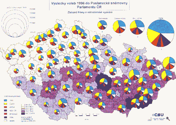
In a Proportional Circle map, the circles represent certain data. The sizes of the circles represent the greater amounts of the data. In the case of this map, it takes the process further by making a pie chart of each circle, and compares a separate data within them. 

http://geographyfieldwork.com/Choropleth2.gif

DOQQ

Digital Orthophoto Quarter Quadrangles are aerial images of land, used by the USGS. It can be considered a photographic map because it does not include relief or difference in surface details.


http://www.nd.edu/~underc/east/maps/documents/UNDERC_DOQQ.bmp

Digital Elevation Map (DEM)

DEM's are representations of land features digitally. They provide a realistic three dimensional view of what a certain area would look like. The terrain, elevations, and coastlines for example can be more clearly viewed using this map. 

http://www.waialeale.org/graphics/kauaioverview.jpg

Digital Raster Graphics (DRG)

A DRG is basically a standard topographic map which has been scanned, which enhances the features on the map. 

http://www.tceq.state.tx.us/assets/public/gis/images/drg.gif

Isopleth


The isopleth map here indicates the temperatures in China. The warmer and cooler temperatures are differentiated through color. 

http://www.bestcountryreports.com/media/D_Images/China_Temp.jpg

Isopach

An isopach map gives the viewer insight to thickness of certain features or resources. This map is showing the shale isopachs in small region. 

http://fayettevilleshale.com/fayetteville%20shale%20isopach%20sample.gif

Isohyet


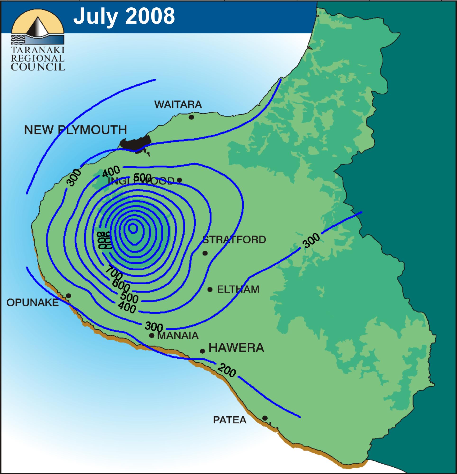
A map with isohyet lines represents the rainfall within the given area. In this map, the more inland areas are the ones that receive the most rainfall, as can be seen with the heavier concentration of lines just to the left of Stratford.
http://img.scoop.co.nz/stories/images/0808/3d0ea09ab5cbfe1ff03f.jpeg

Isotachs


The black lines in this image represent the isotachs. Isotach lines measure the wind speed in the map. 

http://www.erh.noaa.gov/bgm/casestudy/2002/jan19/Jan19_files/image053.gif

Isobar Map


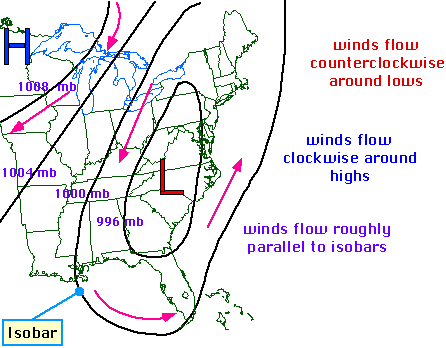
Isobars on a map are lines that show equal pressure. Isobars are contour lines, that are related to weather. Low pressure systems, as shown in this map are usually associated with storms and inclement weather.  

http://ww2010.atmos.uiuc.edu/guides/maps/sfcobs/cntr/gifs/wind1.gif

LIDAR Image


LIDAR images are taken with Light Detection and Ranging technology. This aids in taking the images and converting them into a three dimensional form spatial model, as seen in the map above.
http://www.secon.in/images/lidar/lidar.gif

Doppler Radar Image


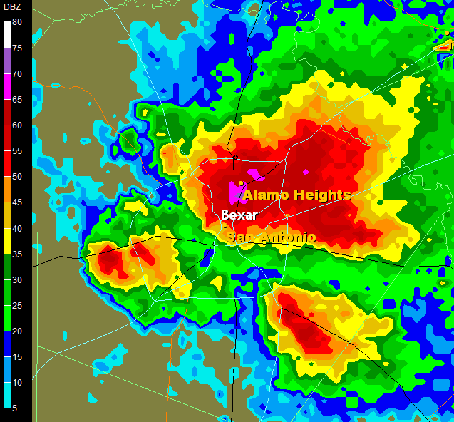
Doppler radar senses the velocity of precipitation. For weather conditions occurring over broader areas, a Doppler radar station is able to pick these patterns up and provide an image for the upcoming weather conditions, such as the example shown. 

http://i147.photobucket.com/albums/r298/alamocitywx/radar5_2_05-1.png

Black and White Aerial Image


Black and white aerial images are photographs taken from airplanes or satellites. The aerial images plainly show areas and their boundaries. The differences in vertical and horizontal shapes can be seen from these kinds of images as well. 

http://www.jaha.org/edu/flood/rebuild/img/panoramas/550w/JT_aerial-1950s-550.jpg

Infrared Aerial Image


Inrared Aerial Images as seen here show infrared wavelengths which are represented with seemingly odd coloring. The red areas show healthier vegetation. This images are helpful in finding land areas that are suffering in terms of poor fertilization and vegetation. 

http://www.agpix.com/catalog/AGPix_aerialarchives/large/AGPix_aerialarchives_0013_Lg.jpg

Statistical Map

A statistical map uses color to outline the demographic that it is attempting to portray. This aids in being able to better distinguish one category from another. 


http://www.hort.purdue.edu/newcrop/cropmap/maine/maps/MEhardy.jpg

Cartogram

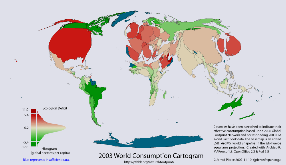
Cartograms can display information through distorted shapes to convey a message. In this map, world consumption is the topic at hand, therefore countries in North America and Europe seem to be inflated while countries in Africa and South America are made to look weak. They are not meant to provide accurate shapes of land.  

http://pthbb.org/natural/footprint/2003/cartogram.gif

Flow Map


Flow maps show movement from one area to another. In this image, a company is conveying the movement of their company into other regions from its main headquarters. Portrayal of communication is the key factor in these maps. 
http://www.geomem.com/images/Products/goldensoftwareinc/mapviewer/FlowMap.png

Isoline Map

Maps with isolines can be used to represent lines of equal value in any map, similar to contour lines. 

http://www.unu.edu/unupress/unupbooks/80157e/80157E0T.GIF

Proportional Circle Maps


Proportional Circle Maps have circles in different sizes which are representative of some sort of statistical data. The sizes of the circle however, how great or small the data represented contains. The areas with the larger circles therefore in this map have greater populations. 

http://www.geog.ucsb.edu/~jeff/gis/proportional_symbols_files/map2.jpg

Dot Distribution Map


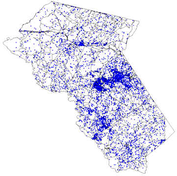
 Dot Distribution Map displaying population densities. The darker areas represent more heavily concentrated areas of population. 

http://www.baconsrebellion.com/Issues03/09-22/Maps/Scatter1.jpg

Propaganda Map

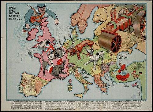
Propaganda maps are created by a country or a group people trying to emphasize or de- emphasize certain regions. They can be satirical as shown in the map above, in which the mapmaker was attempting to make a point about Europe. They usually do not show factual representations of areas. 

http://farm4.static.flickr.com/3281/2722416468_1aebcdebb2.jpg

Hypsometric Map


http://www.bitolaonline.com/images/maps_images/03hipsometrija.jpg

PLSS Map


The PLSS is the Public Land Survey System, which is a coordinate system that shows subdivisions of public land. Most land is divided into square shapes unless there is a physical feature that intersects it, in which case it will create irregular divisions, as seem in this map.

http://www.idwr.idaho.gov/gisdata/tech_note/pers_plss.jpg

Cadastral Maps


Cadastral maps show spatial separations between of boundries. In this map, the separation of counties within these state of Delaware is shown.

http://www.dalisproject.org/images/cadastral_map.jpg

Thematic Map


Thematic maps focus on a a few distributions, and are known to deal with social issues such as population distribution and not necessarily physical land features. These maps can be used to compare or represent something such as climate throughout, or focus on a very small area. 

http://factfinder.census.gov/leg2/68/122137468.gif

Topographic Map


Topographic maps display, though two dimensionally, elevations in the given area. They include contour lines which are representative of elevation off of the ground. The closer the lines, the taller the physical feature, the closer lines show more flat areas. These maps are essential to many, for example, geologists and architects.

http://www.chugachwildernesslodge.com/images/TopoMap.jpg

Planimetric Map


Planimetric maps show areas on a plane, without including any using any vertical representations of anything on it. Only horizontal, flat shape and space can be determined from this type of map.  

http://history.nasa.gov/SP-399/p65s.jpg